In everything there is drawing.
From ancient cave paintings to contemporary digital graphics, people have always used writings, signs, and symbols to leave their mark and tell their stories. The structured system we know as writing, whose earliest roots date back six millennia, seems almost startlingly recent when you consider that Homo sapiens have been around for 200,000 to 300,000 years. What is even more remarkable, however, is the transformative power that writing has had on the course of human history, fueling technological advancements at an ever-accelerating pace.
In more recent times—specifically over the last five centuries in the West—human ingenuity has given rise to typographic printing systems – building upon the ancient practice of relief printing, akin to the inked hands that pressed against cave walls – establishing the modern and rapid diffusion of knowledge. At its core, the concept of engraving a surface to create a printing matrix embodies an economy of means achieved through graphic synthesis. This synthesis not only reinforces a sense of visual unity but also streamlines the way knowledge, information, and content are shared. Moreover, this method allows for the infinite reproduction of ideas, paving the way for an unprecedented proliferation of information.
Engaging with this form of design, which I call typographic language, serves as a means to explore my professional interests, reflections, and learning. Working with this printing system, I am guided by the emotional forces that fuel my journey through graphic expression, shaping my creative experiences along the way.
As relationships between typography and architecture are part of a broader vision of design as language.
In 2013, I edited a small publication titled “Typographic Masters: Impressions of Life,” where I interviewed three professionals in the graphic design industry who were still working with typographic printing in São Paulo. Through oral history, I gathered accounts of their biographies, especially regarding the trades they practiced. The publication, entirely printed by these professionals – with my presence throughout the process as an apprentice – resulted in a graphic experience that constituted a deep understanding of the procedures, technical operations, machinery, and tools of typographic composition and printing, serving as a study of language. Moreover, immersing myself in their memories—both through their spoken recollections and through the atmospheres that lingered in their workplaces—has allowed me to reconstruct specific fragments of São Paulo’s 20th-century history. Through nearly two years of research, I have gained a deeper understanding of both the human scale and the unique nuances that define individual lives, positioning them within a broader social, economic, political, cultural, and historical context. This perspective emerges when the focus on professional practices extends to encompass the complexities of life and its ongoing transformation over time and space. Observing contemporary changes demands a thoughtful consideration of both the past and the present.
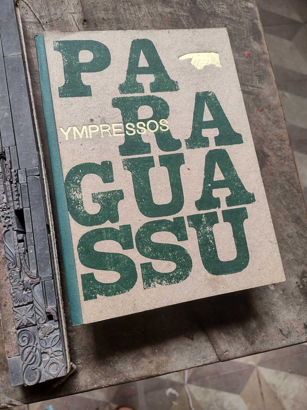
The publication made its way through the small but rapidly expanding circuit of independent publishing fairs, which offered a glimpse into the contemporary editorial landscape. Through these events, I connected with artists, designers, photographers, researchers, and other creatives who share a passion for book arts. In 2017, the Salvador-based collective Sociedade da Prensa released a stunning publication, “Ympressos Paraguassu,” which also reconstructed the history of the printing industry in Bahia, from the city Cachoeira, in the Recôncavo region. I was unable to attend the book launch at the time. However, in 2023, I visited Cachoeira, met the people and professionals involved, and saw the printing presses showcased in this remarkable research by Flavio Oliveiras, Laura Castro, and Thiago Ribeiro.
“Ympressos Paraguassu”, Edtóra, Sociedade da Prensa, 2017.
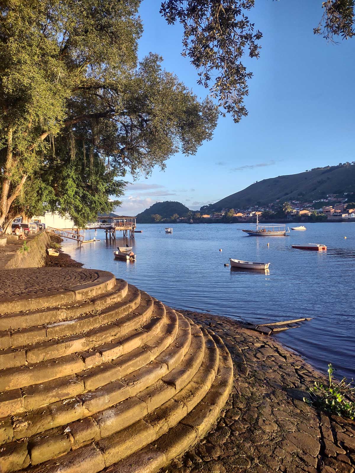
The city of Cachoeira played a crucial role in the development of the state of Bahia. The city is located along the banks of one of the largest rivers in Bahia, the Paraguaçu. The Portuguese occupation dates back to the early 16th century, just 31 years after Cabral’s arrival. At that time, sugar cane plantations and sugar production, later followed by tobacco cultivation, were established in the region. Due to the navigable stretch of the Paraguaçu River to the capital, Salvador, the area was considered the gateway to the hinterlands, functioning as a major commercial hub. It received various products to be distributed throughout the state’s interior and also shipped local production via the river.
This strategic geographic position granted Cachoeira significant economic importance during the 17th and 18th centuries, establishing it as the most important city in the state after Salvador. This prominence also extended naturally to the political arena, as movements for independence from Portugal found fertile ground there, leading to the exclusion of Portuguese forces from the city in June 1822, even before the famous Grito do Ipiranga. This remarkable political engagement resulted in significant investments in the city, including the construction of the first large-scale iron bridge in Brazil, inaugurated in 1885, connecting Cachoeira to its sister city on the opposite side of the Paraguaçu River, São Felix.
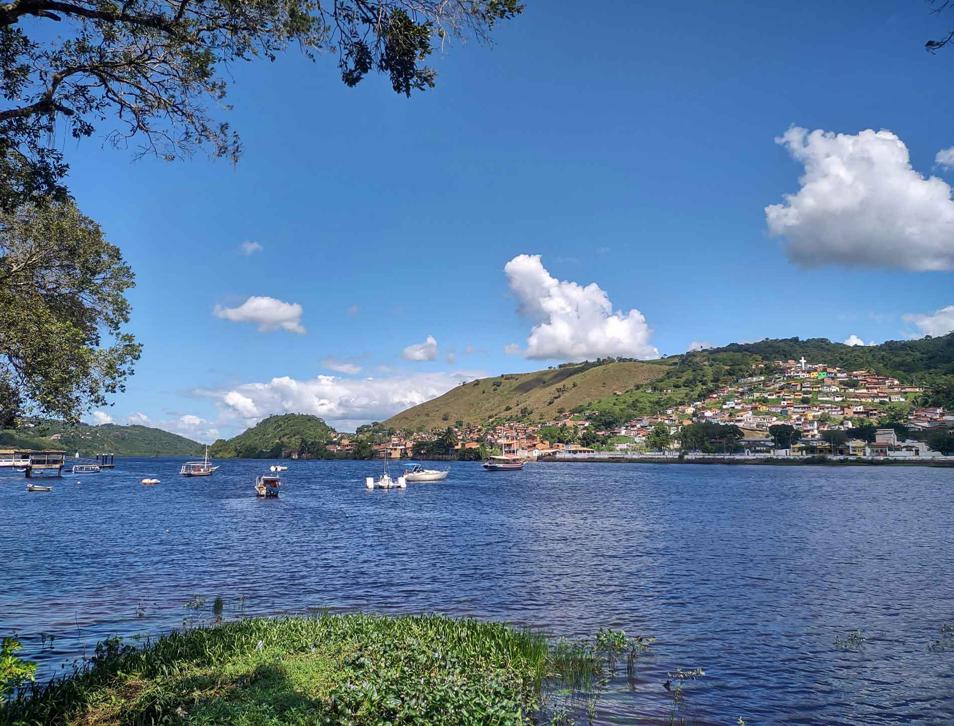
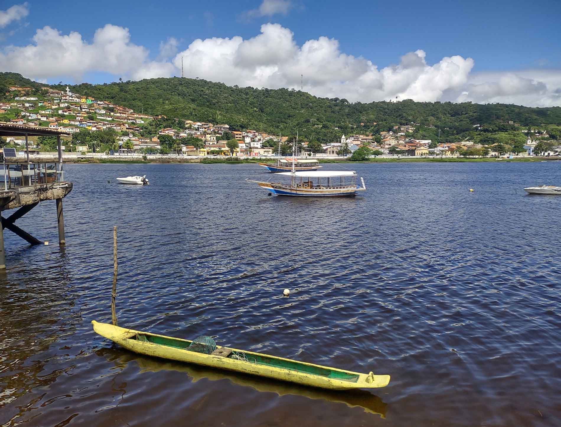
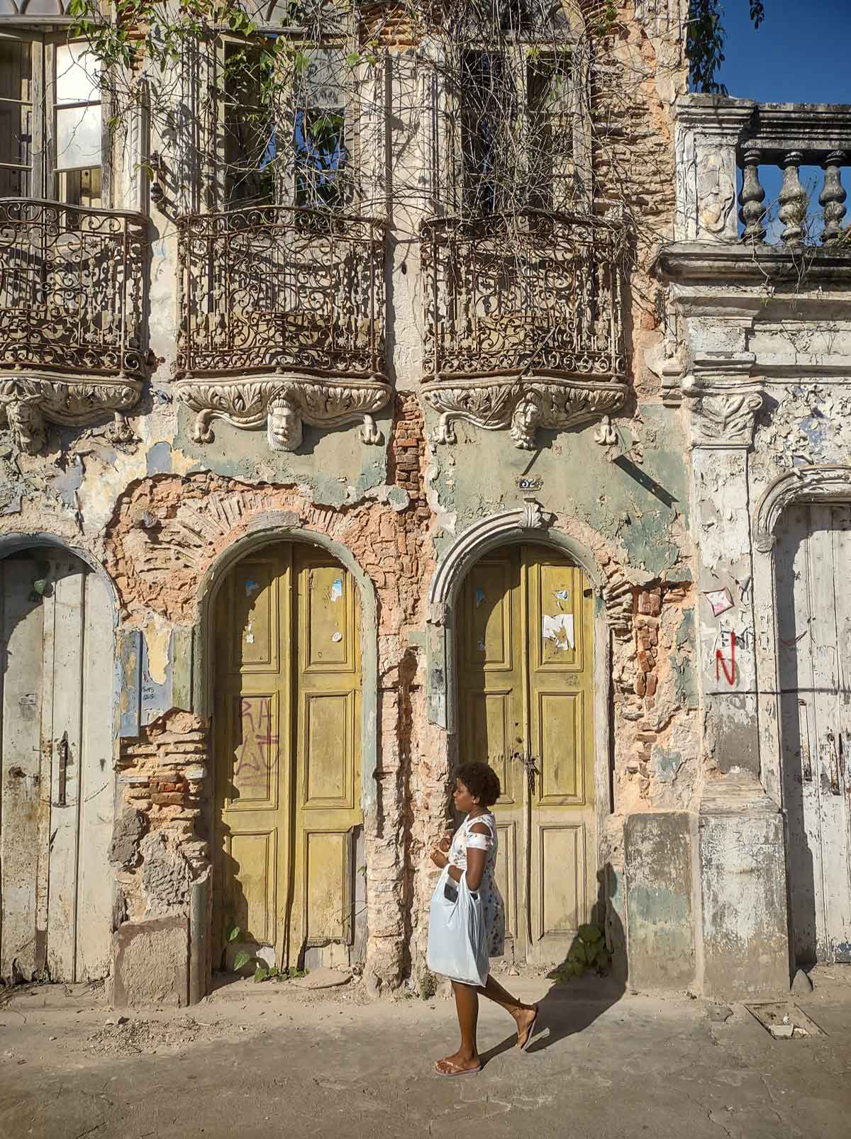
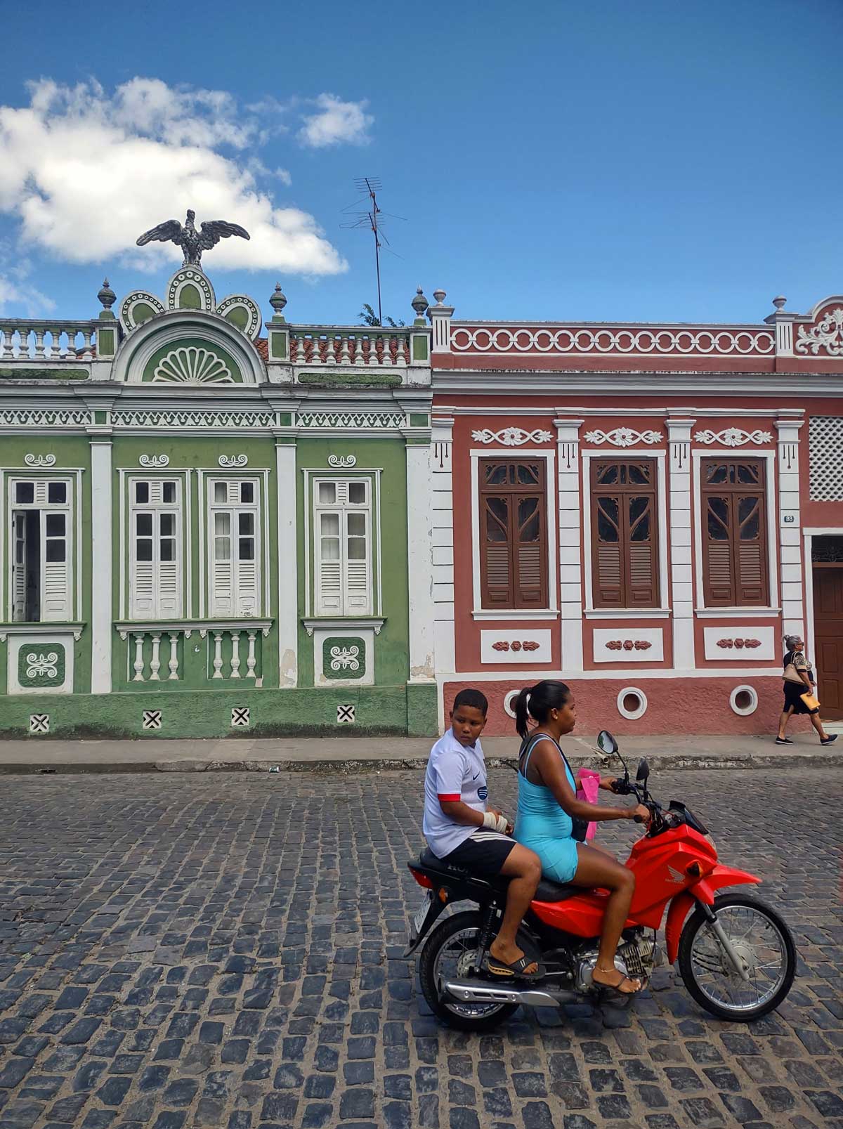
Cachoeira boasts significant architectural heritage, spanning from the colonial 17th century, such as the Chapel of N.S. da Ajuda, located on a high point in the city and the founding site of the settlement, to the eclectic neoclassical styles of the 19th century. This architectural richness also includes the D. Pedro II Bridge, connecting Cachoeira to São Félix. Top images: Paraguaçu River, view of Cachoeira from São Félix. Top-right image: Yellow vessel – a canoe carved from a single wooden trunk.
Following the arrival of Dom João VI in Brazil in 1808 and the subsequent establishment of the Royal Press, official regulations were relaxed, allowing for the creation of private printing establishments—something that had been strictly prohibited prior to that. The first establishment to operate in the city of Salvador was the Silva Serva Typography. It didn’t take long for Cachoeira to also acquire these printing machines and equipment, taking advantage of its proximity to the capital and its role as the gateway to the hinterlands, facilitating the distribution of countless printed materials throughout the state.
A series of shifts in the Brazilian economy led to a decline in Cachoeira’s prominence from the latter half of the 19th century through much of the 20th century. The mining boom in Minas Gerais in the 17th century prompted the relocation of the capital from Salvador to Rio de Janeiro in the 18th century. This transition triggered a gradual but steady process of industrialization during the late 19th century, especially in the southeastern region. However, in recent decades, Cachoeira has experienced a resurgence in economic activity as new businesses have set up shop in the area.
The few remaining printing establishments have adapted to simpler demands, focusing on the production of ephemeral prints for everyday use. The city’s newspaper ceased to be printed in typography in the 1990s, which is surprising given the complexity of its composition, which did not rely on linotype but rather movable types.
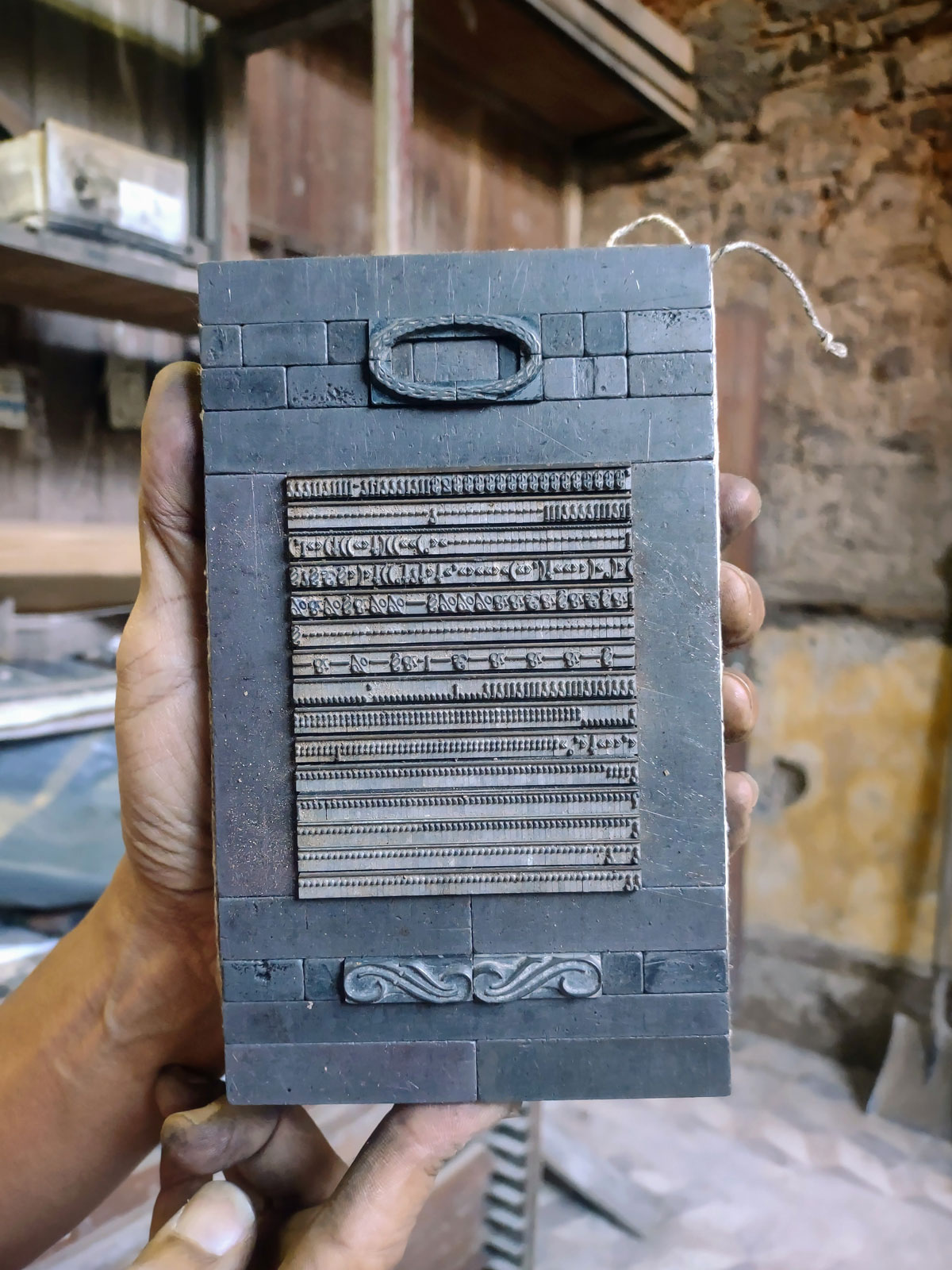
A typographic form set up for printing.
Throughout the 20th century, Cachoeira and São Félix experienced substantial losses in their graphic collections due to repeated floods along the Paraguaçu River. As the typographic printing process grew outdated, it became less commercially viable compared to newer methods like offset and, more recently, digital printing. This shift led to a decline in typographic jobs for graphic design professionals. As a result, typography became increasingly rare, with equipment either falling into disrepair or lying unused, left to the ravages of time. The situation is at a critical point: the generation of owners born in the analog era could still leverage these tools, but the digital revolution dealt a decisive blow, heralding irreversible changes that made traditional printing methods obsolete.
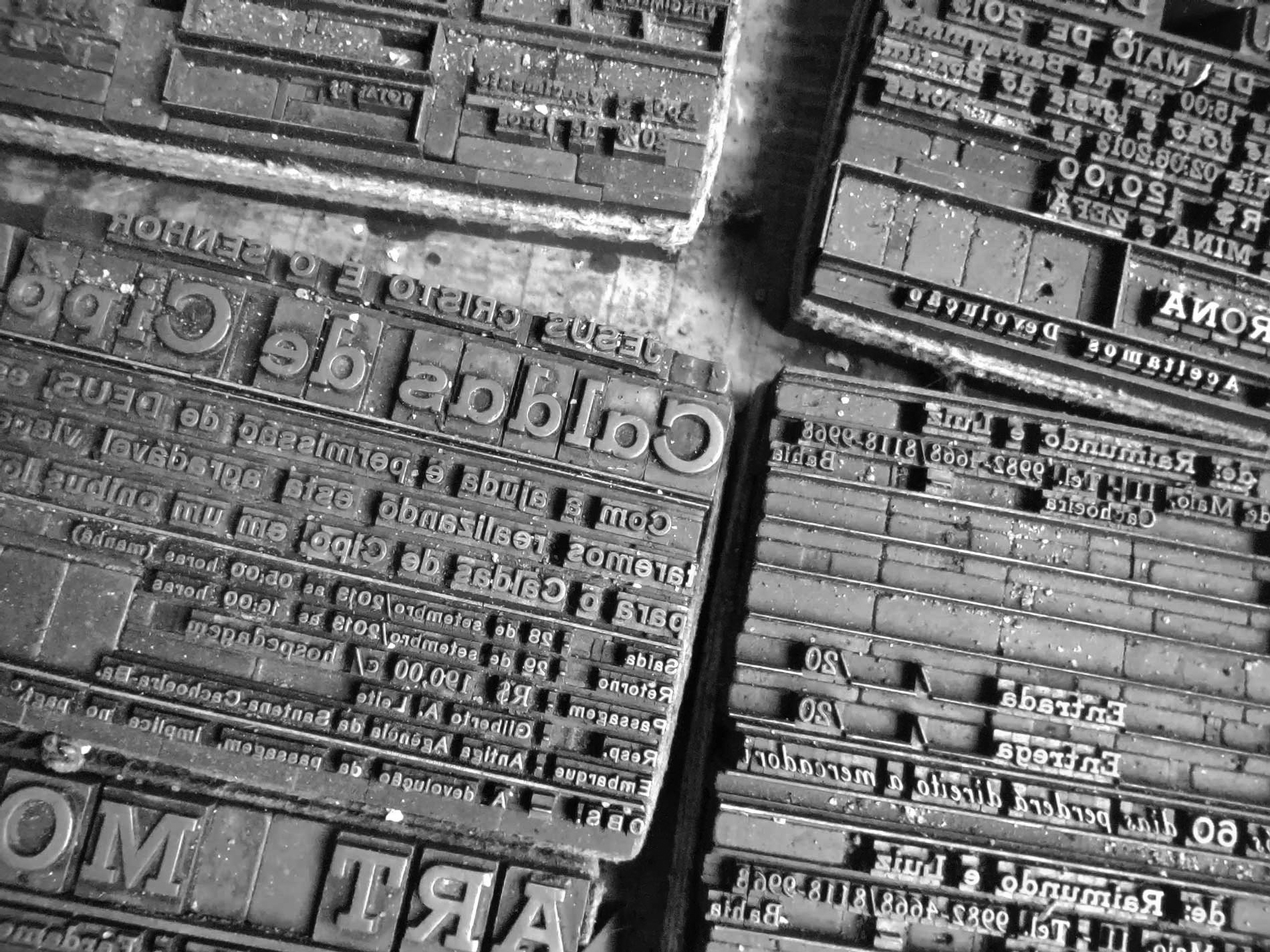
Some printing plates, also known as “chapas,” once printed, are not disassembled and remain bound, waiting for an opportunity for reprinting—a possibility that becomes increasingly rare.
However, the almost artisanal aspect of the typographic printing process, which imparts a distinctive graphic quality—especially the slight relief that marks the paper through the pressure applied to the inked matrix—draws the attention of graphic artists and designers, students, teachers, and researchers. They recognize in this technique a clever system that operates with economy of means and yields highly expressive results. Additionally, it harks back to a very popular, genuinely Brazilian graphic manifestation: cordel booklets, which still play a significant role in our literature and visual culture.
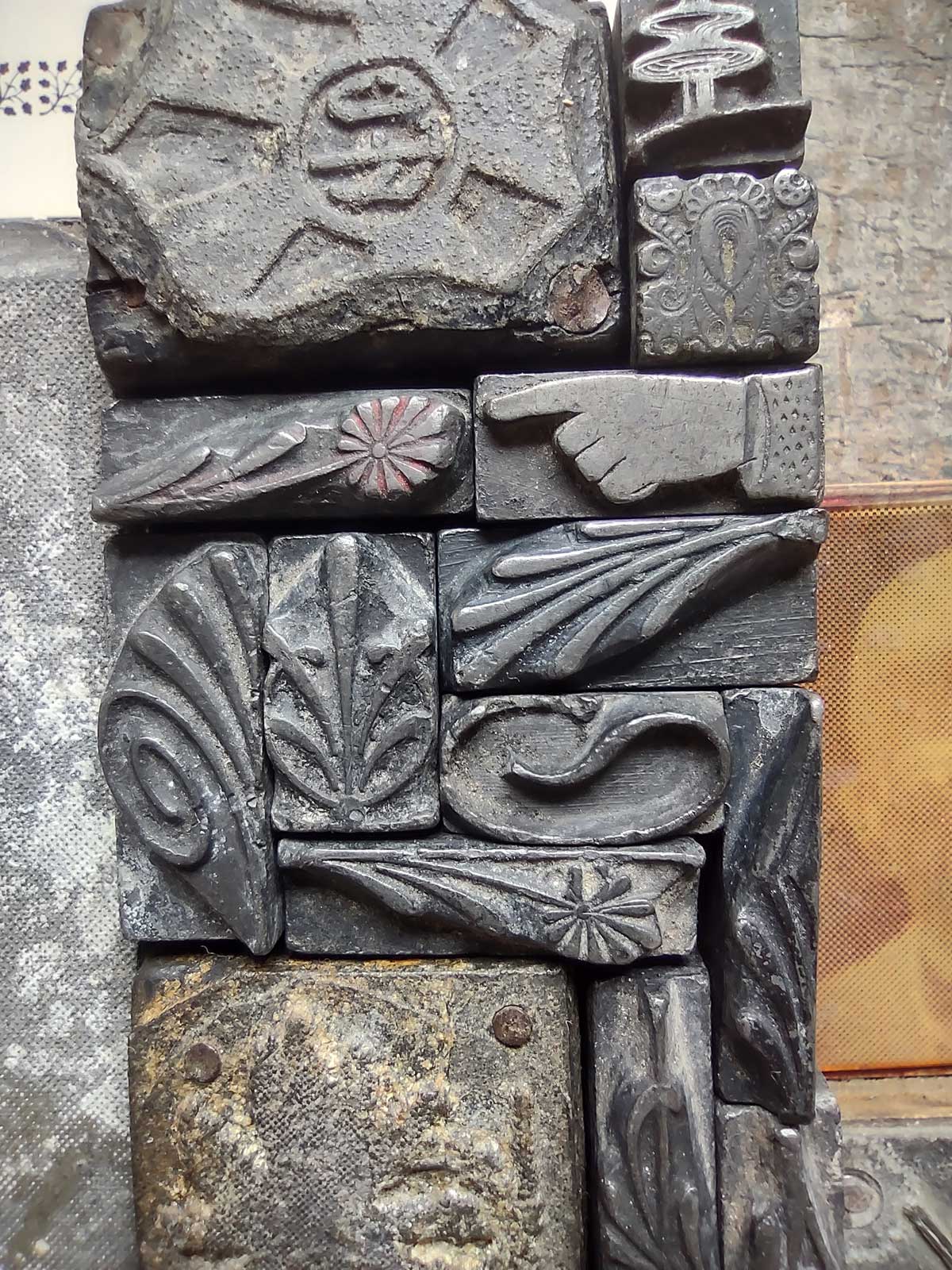
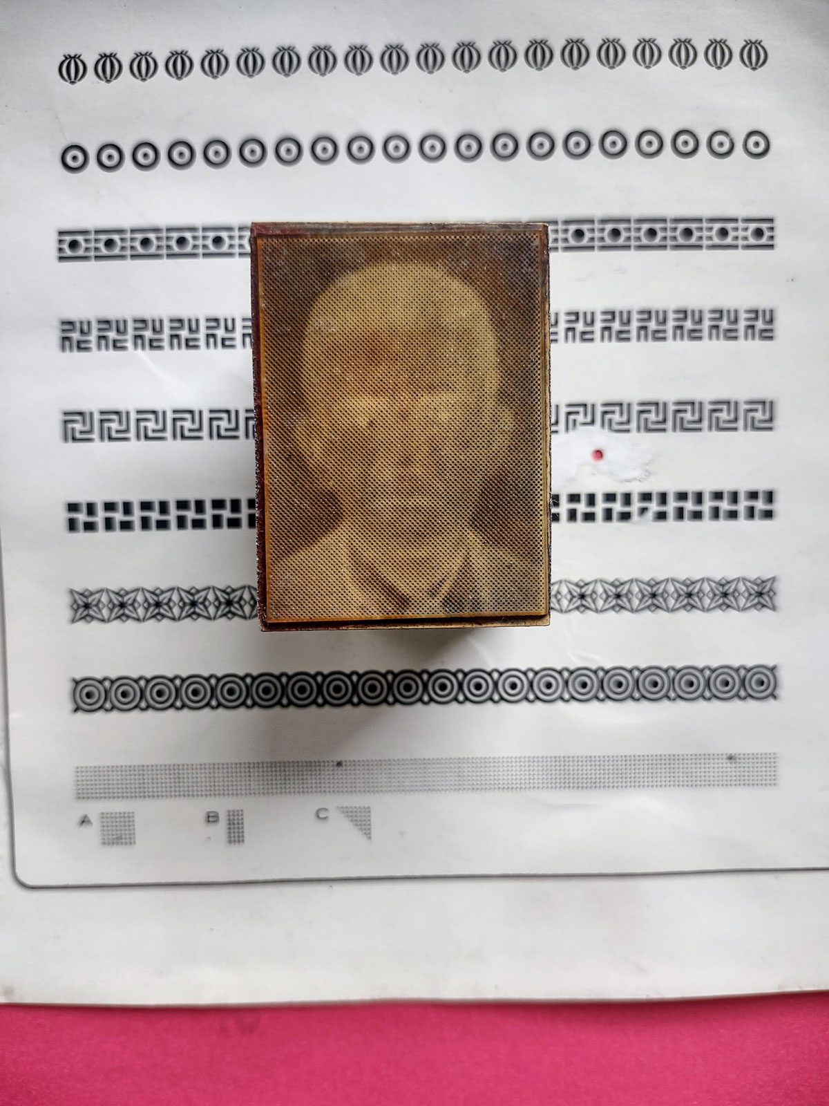
With this perspective, I set out to personally evaluate the current condition of printing shops in the Bahian cities of Cachoeira and São Félix, visiting the region in August 2023. There, I visited two operational printing shops, Gráfica Sãofelista, and Gráfica Líder, both primarily using small Multilith offset printers but still maintaining typographic printers. These include simpler ones like Minervas and more complex ones like fan or plan-cylindrical types from brands such as Heidelberg and the Brazilian brand Catu. The primary composition elements, such as movable type and ornaments, are the most affected by neglect in maintenance: many are “empastelados,” meaning mixed, disorganized, out of their proper boxes and drawers, reinforcing the scenario of abandonment.
I was greeted by printers Addison and Seu Edivaldo from Gráfica Líder with some surprise: “Who is this person interested in old printing shops and what does he really want”? The question seemed to be written on their sun and doubt-creased foreheads. Once I introduced myself as a colleague of their friends from Sociedade da Prensa, who had also visited years earlier and was enthusiastic about historical research on Bahian prints, the conversation flowed better. They soon began sharing the difficulties they faced, exacerbated by the recent coronavirus pandemic. “But can we work and produce some kind of print using movable type?” I asked after they introduced me to the printing shop, with its few rooms and dusty equipment. I would be in the city for a few days and wanted to document them working through photos that could showcase all the stages of typographic printing, from plate (matrix) composition to printing and finishing.
The positive, albeit somewhat hesitant, response was enough to encourage me to arrange for paper at the corner stationery. Gráfica Líder only had white and brown paper, and I thought it would be good to use colored papers like the ones commonly used in printing cordel literature. Since it was a single sheet to be printed, I opted for school-type cardstock with a higher weight.
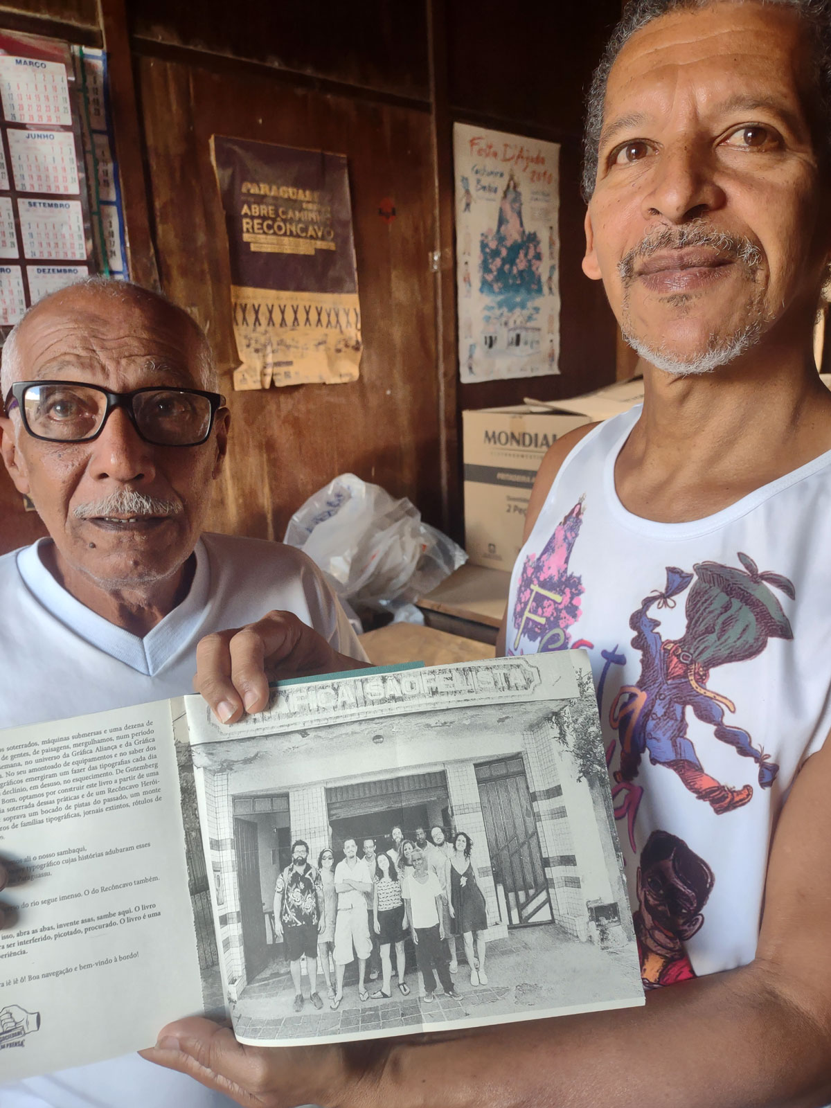
Seu Edivaldo and Addison show a photo from the book “Ympressos Paraguaçu,” featuring the authors and contributors of the publication. Parts of the book were printed at Gráfica Líder and Gráfica Sãofelista.
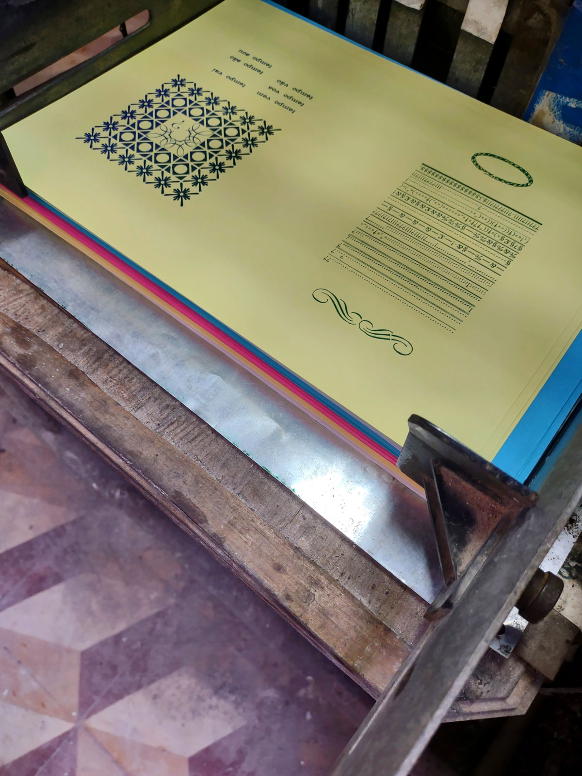
The next morning, Addison and I began to search through the drawers for something that could be printed and represent, in a way, the typographic collection of the printing shop. I chose to print a pre-assembled plate, randomly composed some time ago, to gather certain glyphs and facilitate their rearrangement in the drawers, which had not happened until then. Additionally, we quickly composed some ornaments and text. “It has to have a text, a phrase”, Addison insisted.
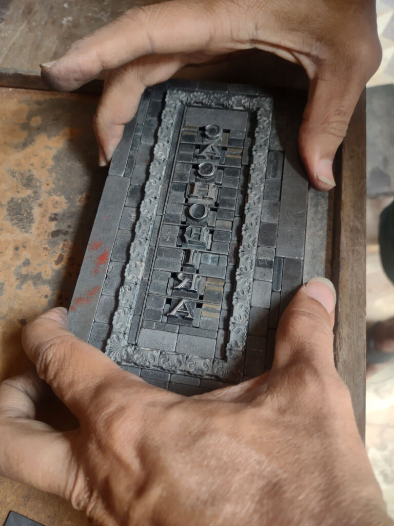
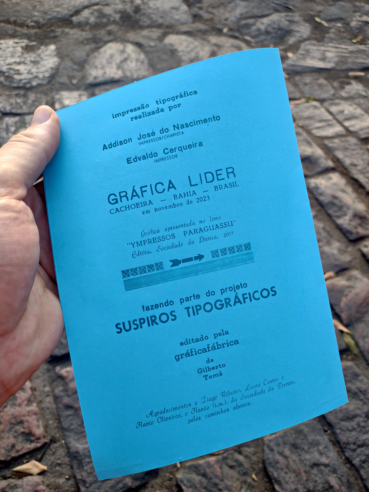
The word Cachoeira was composed with an elegant type (whose name I later identified in a similar digital font, the Regional, redesigned by an Argentine studio, inspired by these Old Style fonts from the late 19th century), vertically framed by ornaments that reminded me of the movement of the waters of the Paraguaçu River. On the back of this leaflet, we would prominently print the names of the artisans and the printing shop, using various fonts such as Grotesca, Futura, and another cursive font.
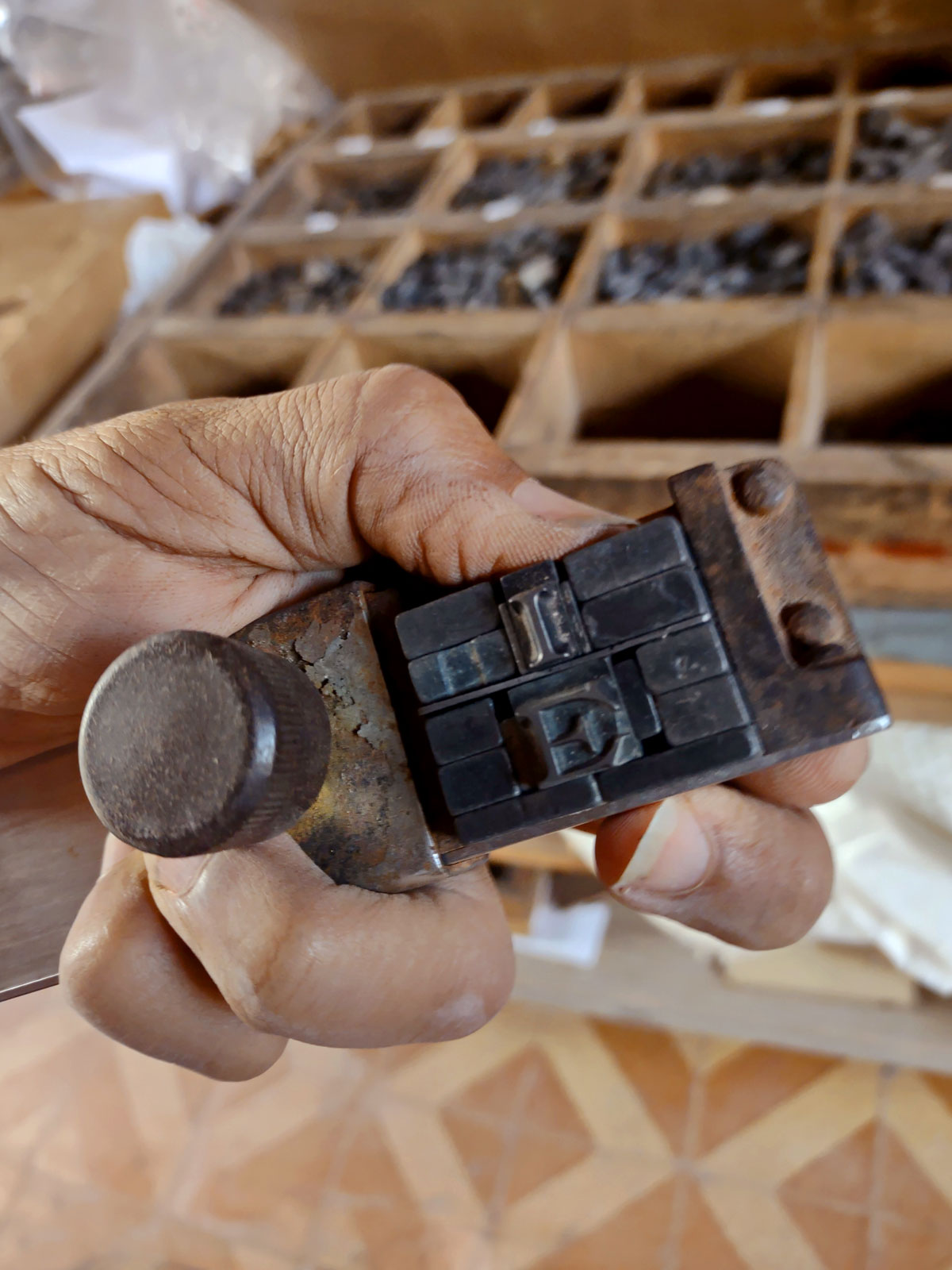
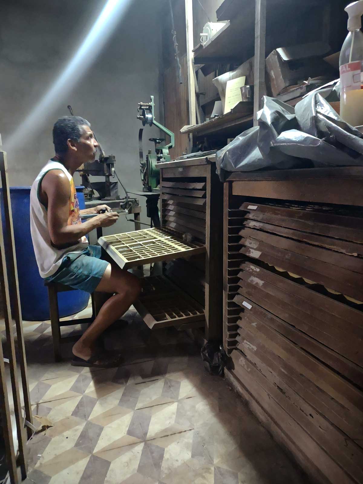
Addison handling the composing stick, where words are assembled with their respective spaces; a set of various glyphs, tied together, waiting to be distributed in the drawers. Addison searching for letters in the drawers. A classic moment for a typesetter: as he reads the text (on an improvised copyholder) to be composed with movable type, Addison skillfully searches for letters in the drawers.
The assembled plates are securely tied and then fitted and locked into a typographic form.
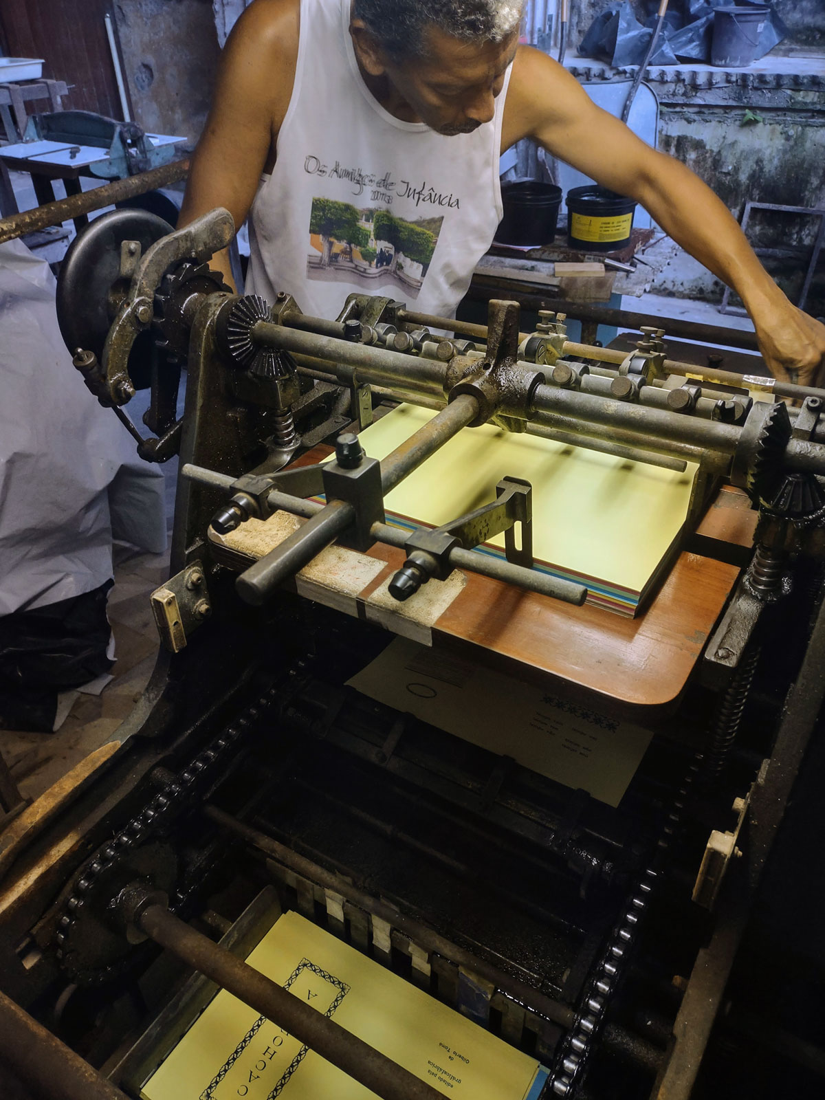
Over the course of two days, we immersed ourselves in the process of composition and printing. I focused on providing guidance for layout and type selection, aiming to intervene as little as possible in Addison’s suggestions and largely following his lead. I was impressed by the speed and efficiency with which he assembled the printing plates, as well as his resourcefulness and creativity in addressing any challenges that arose. His mastery of the materials, tools, and equipment was apparent, especially when operating the printer, a Catu.
His professional demeanor, his gestures, his hands, and the focus in his eyes all revealed that typography is very much alive—alive and kicking, as the saying goes. There’s no trace of decline. The printed piece I brought back from Cachoeira stands as proof of this vitality.
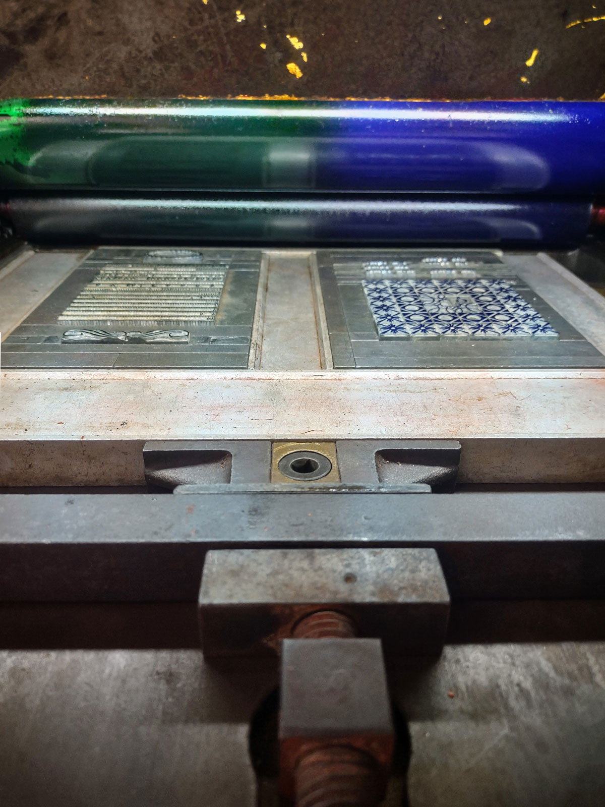
A preliminary proof is made on the plan-cylindrical Catu printer in a creative way: without ink, using only a sheet of carbon paper. The typographic form is prepared, inserted, and fixed in the printer, receiving two ink colors that are applied manually and simultaneously on the inking cylinder.
Typographic craft is one of the ancestral skills and cultural practices that continue to flourish in Cachoeira. The city also serves as a hub for Afro-Brazilian religious traditions, including the Brotherhood of Our Lady of the Good Death, which has been active for over 200 years. In Cachoeira, the roots and cultural foundations of Brazil remain vibrant.
The credits of the final print not only summarize its story and a potential future but also highlight the value of the research conducted by the friends of the Sociedade da Prensa.
Gilberto Tomé is a graphic artist with a degree in architecture and urban planning from FAU, USP. In his studio Gráficafábrica, he crafts his books by hand, and at his Fonte studio, he develops various graphic projects. You can find him on Instagram at @tome.gilberto / @graficafabrica / @fontedesign_sp.
All photographs were taken by Gilberto Tomé during his trip to Cachoeira, Bahia.

